Changing Trends in Calligraphy and Typography: A Comparative Study of Retro and Modern Gujarati Script
Introduction
The Gujarati script (ગુજરાતી લિપિ Gujǎrātī Lipi) is an abugida, like all Nagari writing systems and is used to write the Gujarati and Kutchi languages. It is a variant of Devanagari script differentiated by the loss of the characteristic horizontal line running above the letters and by a number of modifications to some characters.
The Gujarati script was adapted from the Devanagari script to write the Gujarati language. Gujarati language and script developed in three distinct phases — 10th to 15th century, 15th to 17th century and 17th to 19th century. The first phase is marked by use of Prakrit, Apabramsa and its variants such as Paisaci, Shauraseni, Magadhi and Maharashtri. In second phase, Old Gujarati script was in wide use. The earliest known document in the Old Gujarati script is a handwritten manuscript Adi Parva dating from 1591–92 and the script first appeared in print in a 1797 advertisement. The third phase is the use of script developed for ease and fast writing. The use of shirorekha (the topline as in Sanskrit) was abandoned. Until the 19th century it was used mainly for writing letters and keeping accounts, while the Devanagari script was used for literature and academic writings. It is also known as the śarāphī (banker's), vāṇiāśāī (merchant's) or mahājanī (trader's) script. This script became basis for modern script. Later the same script was adopted by writers of manuscripts. Jain community also promoted its use for copying religious texts by hired writers.
I studied in Gujarati medium school and it is my mother tongue also. I used to draw names with the help of shadows, ornamentations, motifs etc. in Guajarati. There were two sign board painters named 'Painter Satish' and 'Painter Avinash' in my town. I used to observe their style of painting sign boards of the shops. It was very fascinating for me. When I was moving through the town, I was regularly observing movie posters of Gujarati Films. Today also I am a keen observer of the same thing in relevance to typography but the way of looking at it is different. So, I decided to analyse and compare 'Gujarati Typography' from my childhood days to recent days.
For better understanding of changing trends, design aspects, creativity, forms and functions, I have divided them into two parts.
A. Retro Style
B. Modern Style
A. Case Studies from Retro Style
1. Use of typography in Gujarati movie posters
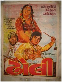
a. 'Dhholi'
Image source: pinterest.com
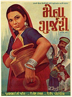
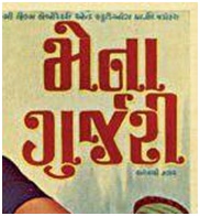
b. 'Mena Gurjari'
Image source: pinterest.com
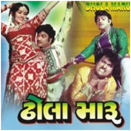
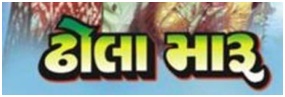
c.'Dhhola Maroo'
Image source: pinterest.com
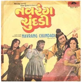
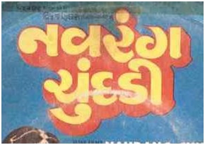
d. 'Navrang Chundadi'
Image source: pinterest.com
The above Gujarati movies were released between 1985 - 1999. It was the time of hand painted Gujarati types. In the first poster a. 'Dhholi', we can see one point perspective, yellow outline with black shadow. The colour of the title is Red. It suggests that there is no use of computer generated typeface. Kerning and Character spacing is not much interesting. The types look heavy and bold similar to hand painted typefaces which were used on sign boards of shops. In the second poster b. 'Mena Gurjari', the types seem slightly decorative and give the feeling of Serif typeface. It is a mixture of geometry and curved serifs with outline. We can see the rounded motifs at the end of each character. The typeface might be inspired by ionic orders Roman pillars.
e. 'Mena Gurjari- details'
Image source: pinterest.com
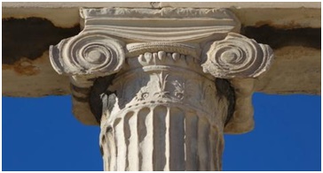
f. 'Ionic order of Greek and Roman architecture'
Image source: smarthistory.org
In the 3rd and 4th posters, the types seem quite funky. They communicate with the viewer in a unique way. The shadows and outlines give the types three dimensional and funky effect like sign boards painters of 1980-1990. They might be inspired and designed by sign board artists of that time.
g. 'Dhhola Maroo- details'
Image source: pinterest.com
h. 'Navrang Chundadi-details'
Image source: pinterest.com
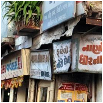
i. Sign boards of Ahmedabad City
Image source: grami.me
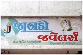
j. 'Sign Board by painter Umesh, Rajkot
Image source: kultureshop.in
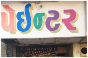
k. 'Sign Board by painter Umesh, Rajkot
Image source: justdial.com
The above case studies suggests the retro style of hand painted types in 'Gujarati'. The above left (j) is the example of 'Janki Jwellers' painted by painter Umesh. In this board he tried to create 3 dimensional lettering effect. He painted the base of Janki in blue colour and dimensions using different pigments of blue. The above right (k) is another example of hand painted sign board by painter Umesh. We can see the colourful gradients to get 3 dimensional effect in the letters. This is another approach to get 3D effect on 2D surface. Both the examples above convey the magic of a painter's brush. The 3D effects, variety in forms, optical setting of the letters, use of multiple colours is the identity of retro sign boards.
B. Case Studies from Modern Style
1. Use of typography in Gujarati movie posters
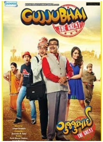
l. 'Gujjubhai'
Image source: pinterest.com
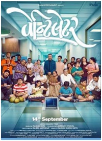
m. 'Vantilator'
Image source: pinterest.com
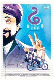
n. 'Dhh'
Image source: pinterest.com
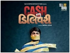
o. 'Cash on Delivery'
Image source: pinterest.com
The above Gujarati movies have been released recently. The desktop publishing has changed the whole trend of retro style of typography in Gujarati script. All the four posters above are showing possibilities, creativity and use of computer graphics which were not possible in retro style. In the first movie poster (l) 'Gujjubhai', we can see the gradient of dark and light blue on the background of letters and computer generated 3D typeface is used with pale and light yellow colour gradient. In the second movie poster (m) 'Vantilator', we can see the calligraphic strokes with flourishes which was invisible in retro style. In the third movie poster (n) 'Dhh', we can see the simplicity of the letter form and in the fourth movie poster (o) 'Cash on Delivery', we can see the experiment of 'talking typography'. Here 'S' is replaced with the universal sign of dollar '$'. Even there is a use of light in letterforms also. It is generated in 3D graphics softwares.
2. Use of typography in 'Gujarati' Digital sign boards
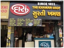
p. 'Daas Khaman Shop'
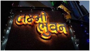
q. 'Lakshmi Bhuvan'
Conclusion
Ratro style of typography in 'Gujarati' script suggests the creative use of multiple colours, shadows, 3 dimensional effect on 2D surface, skills, use of brush strokes and optical settings of letter forms. Whie Modern style suggests innovative use of multilingual fonts, use of computer graphics, digital effects, explorations in typography and calligraphy, digital equipments like digital pen, light and creativity using interesting letterforms related to the topic. Street painters around India are rapidly going out of business in Modern Era because of Digital Technology and Printing Technology but there are a few projects initiated by 'Hanif Kureshi' and 'Ektype' to promote the street painters in this Modern Era.
References:
- http://www.handpaintedtype.com
- https://ektype.in