TYPEसाइप– The Conceptual Typographic Dialogues
Introduction
“Form and function together create typographic excellence.”– R. Roger Remington
A poet writes poems using rhyming words.
A copywriter writes headlines and taglines using rhyming words in advertising.
A lyricist writes rhyming words for songs.
These 'rhyming' aspects always attract viewers or readers. We all are fascinated towards particular types, letterforms, colours, calligraphy, graffiti, signages, quotes etc. However, have you ever questioned yourself why you are fascinated towards something? What are the reasons behind it?
'Vibrations' are always attached to living and non-living things. A person can have positive or negative vibrations. A stone or a feather can have similar vibrations. In the same manner letterforms, typefaces, numerals and special characters have their vibrations, energy and aura.
Nowadays, the designers are exploring typography through various forms, e.g. calligraphy, graffiti, installations, crafts, type design, paintings, posters, signages etc. Here, my approach is to experiment and explore the letterforms or words in such a manner so that the inner vibrations can come out through their drawings, paintings, sculptures, installations and in the form of interactive media. They have to express their ideas through typographic artworks. This paper aims to explore 'Typography' as the mainstream of art like paintings, sculptures, installations etc. My mentoring efforts mainly focus on material exploration, production techniques, conceptualisation and creativity. My paper may open a new door for teaching typography to the school children using various materials. This approach would enhance the interest in the teaching-learning process of basic typography.
'TYPEसाइप'was a manifestation of expressions and personal 'vibrations' through Conceptual Typography. It was an innovative approach taken by BVA 3rd year students of Applied Arts to incorporate their concepts in creating artworks made of letterforms. It aimed to be experimental and also interdisciplinary as it was an unconventional approach to materialize their ideas. They explored various materials and production techniques to present their artworks in the most contemporary yet playful manner.
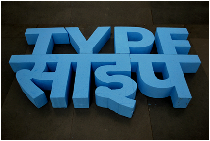
'TYPEसाइप' – Exhibition of conceptual typography was held on 23rd to 25th February 2019 at Exhibition Hall, Faculty of Fine Arts, The Maharaja Sayajirao University of Baroda, Vadodara, Gujarat, India.
Here, I will discuss the selected artworks as case studies with the prospects and possibilities in the production of the creative typographic dialogues.
2. Case Studies: 'TYPEसाइप' – Exhibition of Conceptual Typography
2.1 Adnan Mohmmed: ‘Existing Alphabets’
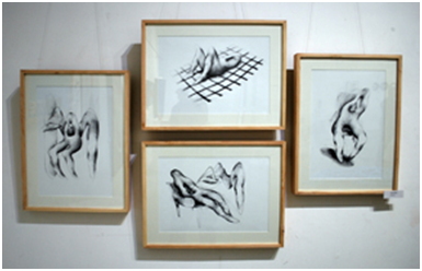
Fig. 1
Fig. 2
He explored his initials (A & M) as human figures and depicted the human activities on the beach. The letterforms are taking a sunbath, having drinks and enjoying surfing. It seems that he is much fascinated with beach life and shared his own experience through life study of letterforms (fig. 1 & 2). These black & white pencil drawings also give some nostalgic aspect to the viewers.
2.2 Dhvani Jadav: ‘Let’s Meditate!’
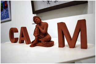
Fig. 3
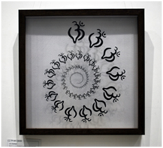
Fig. 4
Her work is evaluating the significance of AUM to see inside one’s soul. Her works suggest concentration, steadiness, peace & Calm. She created the word ‘CALM’ (fig.3) with clay and placed the image of Buddha in place of ‘L’ which represents meditation. Another work (fig. 4) is about the power of symbol ‘AUM’. She placed this symbol with a rhythmic on four slices of glass. The glass engraving was done to get the visibility on class. Her works claim to increase energy level and performance at the workplace.
2.3 Dilip Makwana: ‘Farmer’s Life’
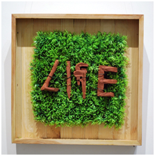
Fig. 5
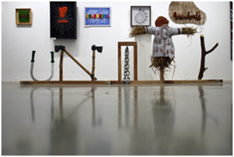
Fig. 6
The above works represent the life of a farmer in India. A farmer produces seeds for everyone. He used the agricultural tool like spade, axe, sickle, scarecrow etc. to depict the words ‘LIFE’ and ‘UNITY’. He created clay to construct the word ‘LIFE’ (fig.5) and placed them on green grass to relate the relationship between nature and soil. That is the life of a farmer. He used actual agricultural tools to construct the word ‘UNITY’ (fig.6). This life-size work does not need many explanations because we can easily communicate with it visually and typographically.
2.4 Janhvi Kriplani: ‘Past’
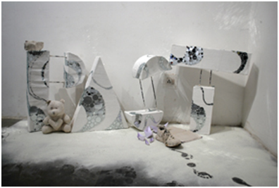
Fig. 7
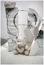
Fig. 8
‘Gone by in time and no longer existing.’
She represented a nostalgia through the word ‘PAST’. No one can change the past, forgotten, or erased. She tried robust letterforms to portray solidarity and rigidity through the materials like plaster of Paris (POP), iron rods and mirrors (fig.7 & 8). Something which is frozen because sometimes we have to accept that certain things will never go back to how they used to be. Block, like typography, shows the heaviness and the weight of our past on us. The footprints and paper boats on the floor also throw the light on nostalgic feelings of the viewer.
2.5 K S Shrivathsa: ‘Assembly’
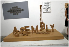
Fig. 9
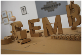
Fig. 10
Here, we can see how people take their position in the assembly line or their fixed position. Papercraft technique is used to construct this artwork from cardboard. This artwork is also having some feeling like railway yard of huge containers where the huge crane is used to pick up the containers and place them on trucks (fig. 9 & 10).
2.6 Parv Jani: ‘Organised’
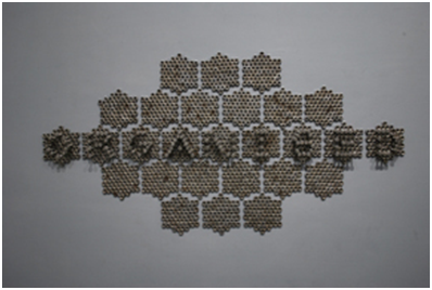
Fig. 11
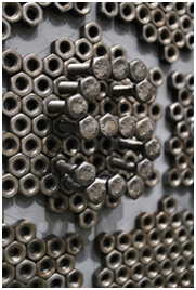
Fig. 12
The primary geometric hexagonal forms are creating magic here. He used nuts and bolts as essential ingredients to express his idea (fig.11 & 12). Nuts and bolts cannot stand alone. They have to be organised with each other then only they can perform. Grid is the basic necessity to create a good layout. We find grid structures in nature and surroundings like architecture, newspaper, magazines etc. Here also, he repeated hexagonal grid structures of nuts and bolts, played with positive and negative spaces and created this creative chunk. The best learning part of this artwork is the creation of letterforms and words using nuts and bolts together.
2.7 Praful Gohel: ‘Peace’
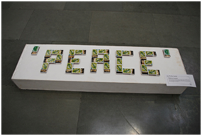
Fig. 13
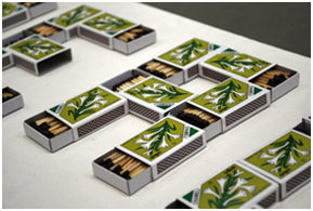
Fig. 14
We use safety matches to light a lamp, candle and fire etc. However, it also depends on how we use them (fig. 13 & 14). I wanted to give a message that we should use our energy for constructive manner not in a destructive manner. This artwork was the homage to Indian soldiers who died in Pulwama Attack on 14th February 2019. I combined two opposites like matches and the word ‘Peace’. Half opened matchboxes intersected with each other to construct the letterforms.
2.8 Prachi Dalal: ‘Perception’
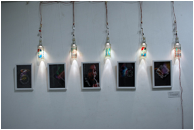
Fig. 15
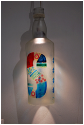
Fig. 16
Our senses are potent to pursue things in a better way. She used empty glass bottles, engraved letterforms on glass with glass paint, acrylic sheets and digital prints to represent her idea typographically (fig. 15 & 16). We can see the word ‘sense’ which was creatively engraved on empty glass bottles and then painted. There are five frames just below it with the amalgamation of all our senses and typography. She tried to depict our senses through these five frames.
2.9 Ridhhi Dave: ‘Gift’
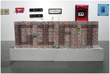
Fig. 17
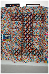
Fig. 1
Excitement is a feeling or situation with full of activities, joy and exhilaration. People always feel excited when they get gifts, particularly on their birthdays. She tried to portray excitement through the word ‘Gift’ (fig. 17 & 18). She made the paper boxes and wrapped them with gift wrapping papers. The patterns on the outer surfaces differentiate the other boxes and represent the word ‘Gift’.
3. Conclusions
Most of the above artworks deal with ideas concepts to convey their dialogues through typographic experiments. Being a mentor, I attempted to explore typography through vibrations. We explored the various aspects like meditation, excitements, sensitivity, moods, nostalgia, memories, personalities etc. The students were free to explore and experiment on any theme through typography, but their artworks must express their thoughts, ideas or concepts without any explanations. The thinking process and execution was the best part ofthe teaching-learning process. The students also got the chance to explore their inherent abilities and skills which they were unable to apply in academics. The students took the help from the people of various disciplines like painting, sculpture, mural etc. for executing their concepts typographically. So, it was the multidisciplinary approach in terms of learning. These conceptual typographic dialogues helped many students, school teachers and viewers to understand the typographic explorations uniquely.
The journey of 'TYPEसाइप' will be continued in the form of workshops for school children. The students would be the mentors, and these workshops would help the students to enhance their creativity through letterforms.
REFERENCES
- Sprinkle Eric (2014), Keywords: Abstract Word Designs, Createspace.
- Petry Michael (2018), The Word is Art, Thames and Hudson.
- https://www.northeastern.edu/visualization/events/roger-remington-design-and-science-will-burtin-pioneer-of-information-design/